SharePoint helps teams collaborate, whether they’re made up of 100 people in one location or tens of thousands of people located across the world. Out of the box, the tool can help users communicate internally and collaborate on projects by storing documents, collecting information, and sharing it with segmented groups. What users interact with is a secure website that gives them the freedom and flexibility to be more productive no matter where colleagues are located.
However, SharePoint’s look and feel out of the box and can often leave much to be desired, leading to low adoption rates across an enterprise. A hard to navigate website that doesn’t look and feel like what users have become accustomed to can make or break a company’s SharePoint deployment.
While Microsoft has made—and continues to make—great strides with the user interface, users still struggle with SharePoint’s out-of-the-box user interface. What differentiates a SharePoint site that is hard to navigate and underutilized from one that truly impacts collaboration and productivity is great design and user interface/user experience (UI/UX) work.
As users across an enterprise move through a SharePoint environment or site, it helps if the navigation, data views such as charts or spreadsheets, reports, content and forms are branded consistently. Think about your own experience: For example, when navigating through an online store where a payment page looks different than a product page might give you pause, cause a little bit of confusion, or even make you lose trust in the site and abandon your purchase.
The same goes for SharePoint.
With the help of a SharePoint developer, a UI/UX expert, an experienced graphic designer and a set of brand standards, you can design a SharePoint site that’s focused on the user.
The right mix of creative design and technical knowledge can enrich SharePoint and make it even more user-friendly. Enhancements to HTML, CSS, JavaScript, client side object model (CSOM), REST, JSON, and .Net can, for example, incorporate various branding elements or change the way forms look on a page.
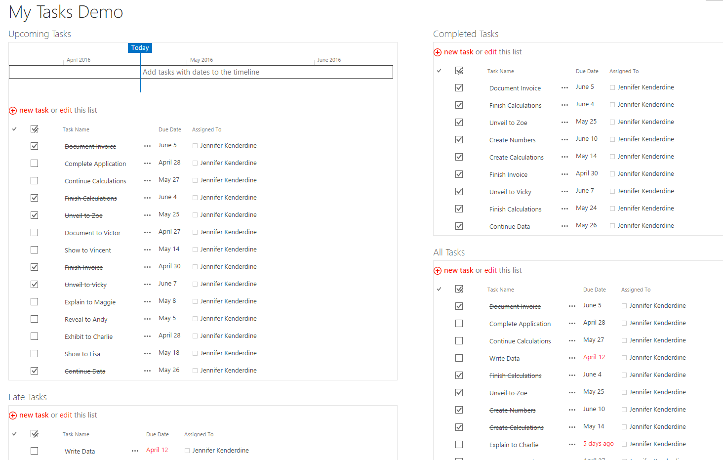
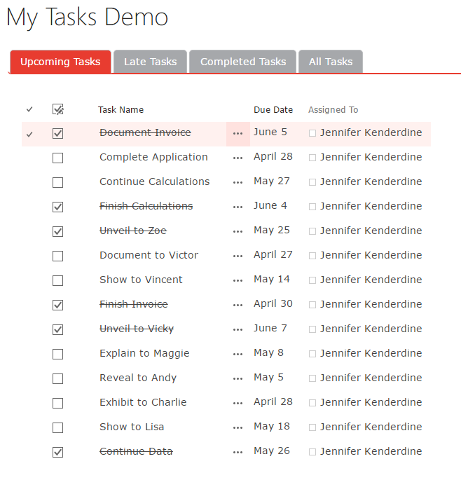
List views are widely used across SharePoint to display different types of information, from news items, to documents available for download, to events, and more. The out-of-the-box functionality uses a large un-formatted table to display the title, URL, a description, notes and filters. This bare-bones table includes all the information an administrator needs to properly organize data and set up filters; however, the initial display is completely unbranded and anything but user friendly.
But with the right design, some user interface skills and a bit of JavaScript, traditional list views are designed to show only needed information like a linked title and description. Additional features like filtering are displayed at the top of the page (and also designed to incorporate branded “filter” buttons), instead of within each table entry, making the list of resources much more user friendly. Rather than a interacting with a very wide table which users must scroll left-right and up-down to navigate, the experience is much better.
BEFORE:
AFTER:
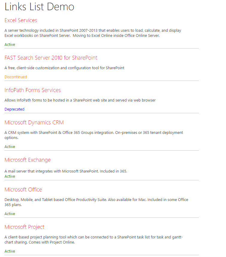
Likewise, lists of links, which are also displayed in an un-formatted, unsightly table with several fields, can be styled to appear as a single list of destinations you’d find on a homepage. These are just a few examples of how you can customize
SharePoint for your organization.
BEFORE:
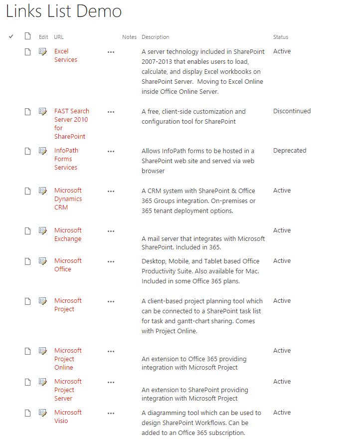
AFTER:
With all of the customization options, it’s easy to over-customize. There are, however, times when the out-of-the-box functionality for a part of SharePoint works well and doesn’t need to be customized. For example, Alerts that notify a small group of people when part of a workflow is completed is standard within SharePoint. It’s not necessary to overdevelop or over-design this functionality unless user needs dictate something different.
To make the best use of SharePoint and ensure it’s adopted across all groups in an enterprise, it’s best to have a good understanding of how it’ll be used and which parts of SharePoint should be modified, as well as which parts work well out-of-the-box. Determining the mix of standard functionality with unique, branded elements will help you get the most out of your SharePoint investment and ensure maximum user adoption.
